Who is TriTech Automation?
An American owned turnkey industrial technology delivery partner that serves large businesses in controls engineering, equipment fabrication, industrial networking. electrical engineer and design and other services. They were looking to expand their business nationwide and needed potential clients to have a source of information to go to to showcase their work, expertise and knowledge.
The Problem
Before redesigning their website, they had no branding in place so they did not stand out amongst their competitors. Their site was outdated and lacking a lot of crucial information on what they do and how to contact them. Also heir current site did not get much engagement. They needed to make a good first impression for new customers since they wanted to be reached organically vs through a vendor.
My Role
I was in charge of creating their branding and worked with them on their core values of what the company was about for it's employees and clients. I also was part of the creative kick-off, discovery phase, the sitemap, wireframes, final designs, presenting the work to the client, as well as the hand-off to developer.
Main Points from Stakeholder Interviews:
They wanted to have their own voice that made them different from their competitors. They also needed to attract new customers and part of that was gaining trust in them as a company. Overall they needed a more thoughtfully laid out website with more detailed content and exciting photos to keep the user interested. Lastly they needed a better way for potential customers to get ahold of them.
Key Differentiators
They are family-owned and value that they are a American company. They also value making strong partnerships with other companies. Lastly, they are a single point of contact for project execution. They take pride in the fact that they deliver solutions to market much faster than their competitors.
Target Audience
Corporate engineers, project managers, operations managers, etc.
Sitemap and Content Schema
After interviewing and researching from stakeholders, employees and competitors; I sat down with my team to establish the sitemap and dissect new information that I did not fully understand. This took much more research into other competitor sites as well as plenty of Googling.
Modular Approach
TriTech needed to be able to update their blog section, testimonials, and any other news on the company site, so it was imperative that they had flexibility and ease-of-use within the back-end of the site. Therefore I designed custom modules so that anyone with basic Wordpress experience could go to change out/upload new content however way they wanted without being locked into a single layout.
Main Modules and Content Included:
- Impressive homepage to pull user in
- Methodology page
- Projects page
- Call-to-action pop-up bar
- Contact page with forms vs just providing a phone number to reach them
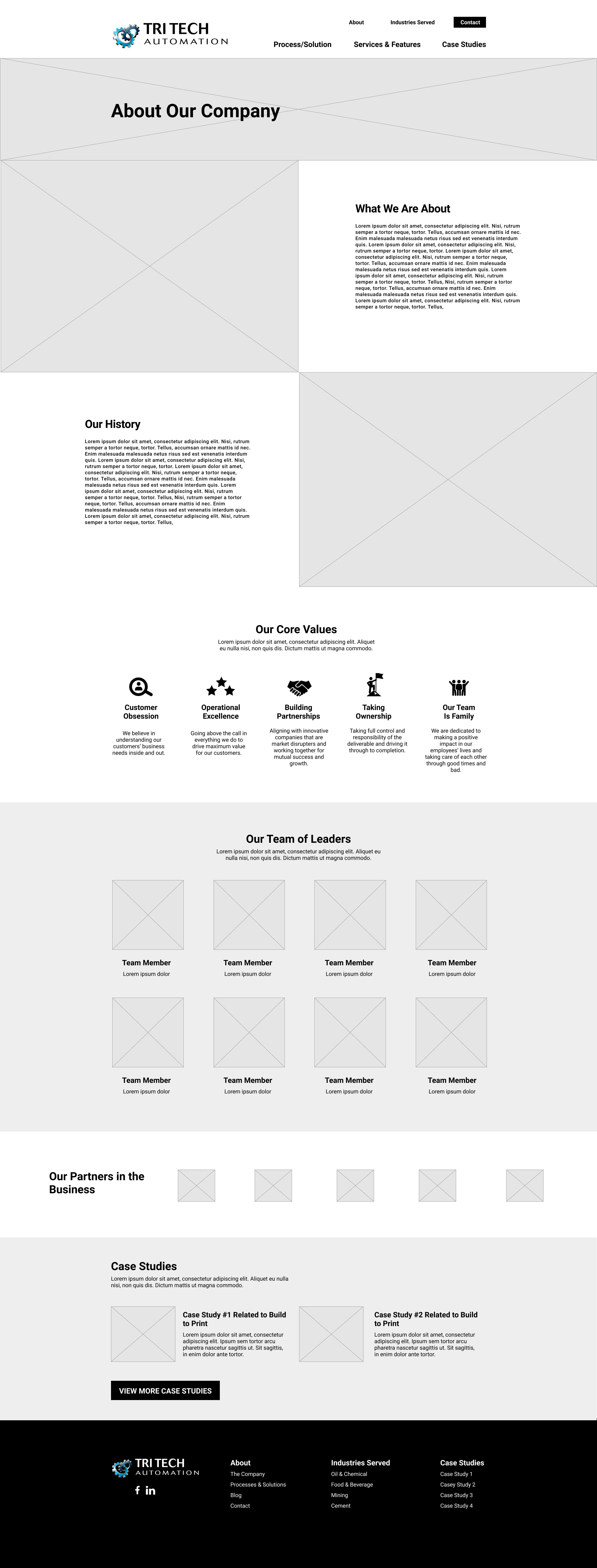
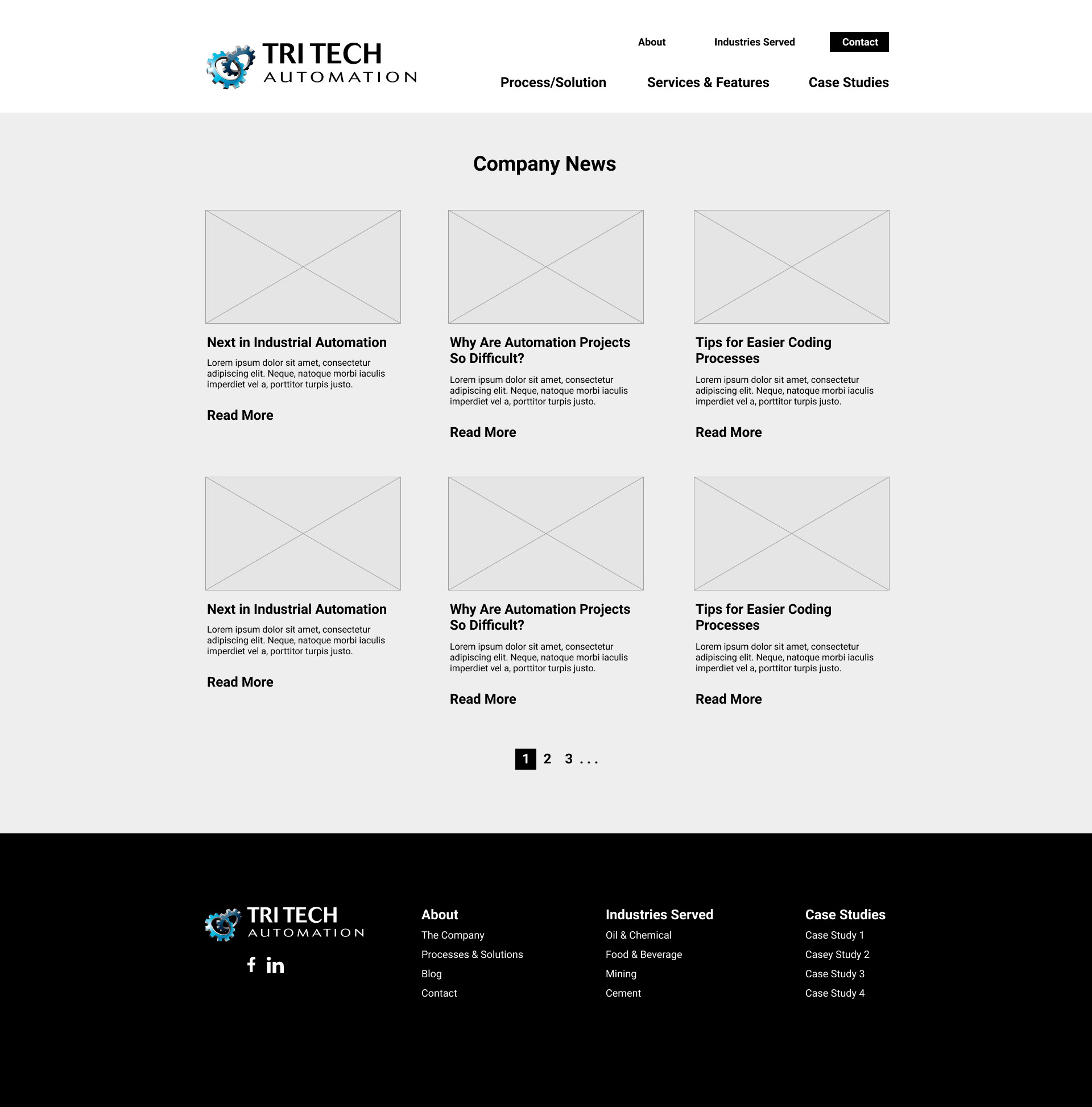
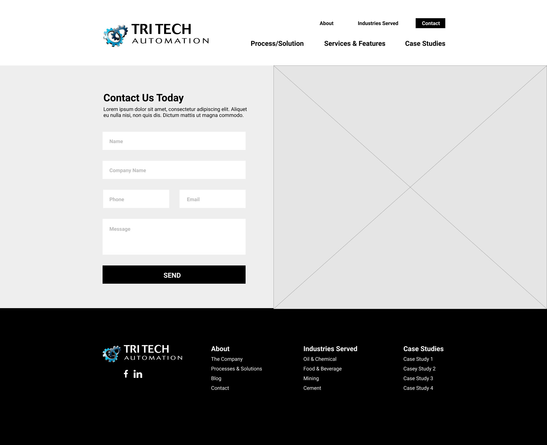
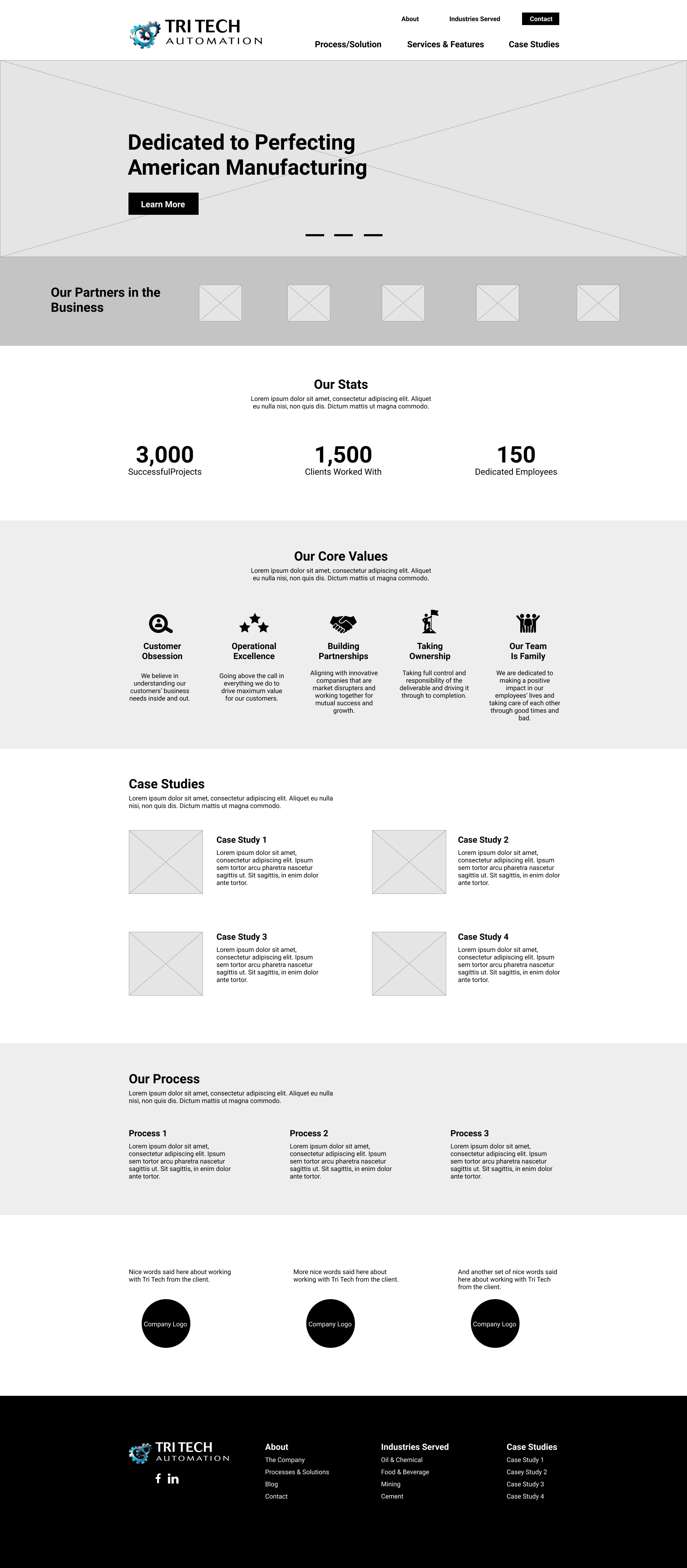
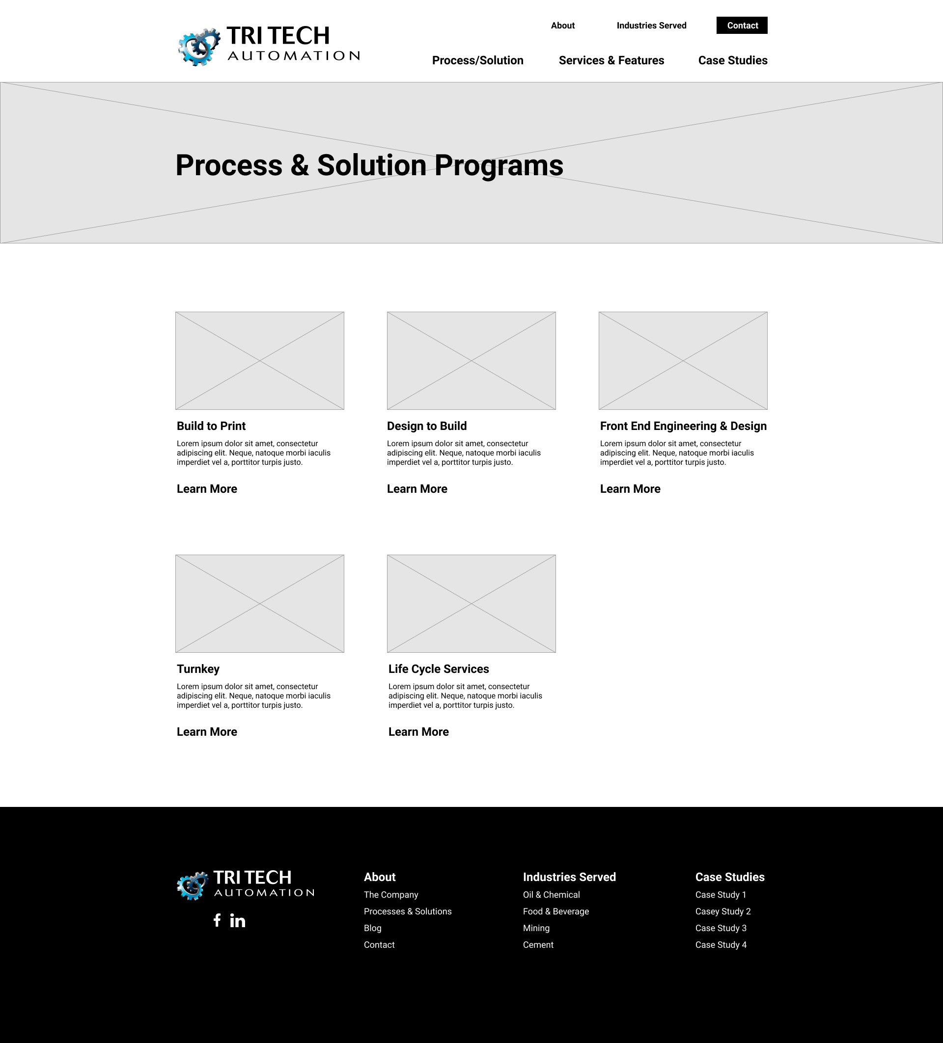
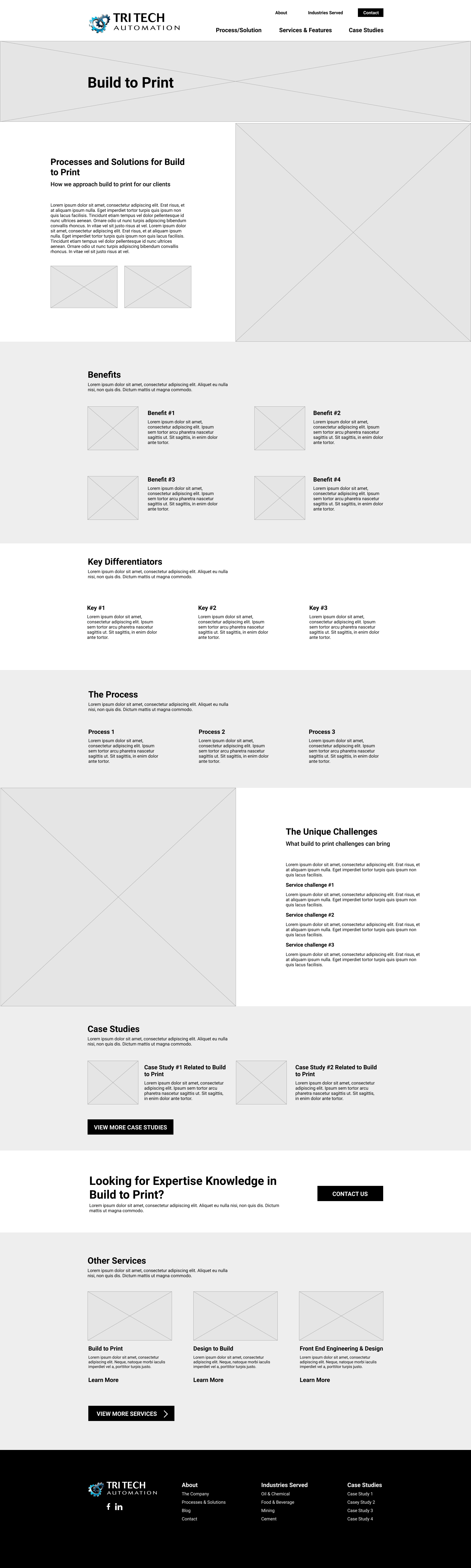
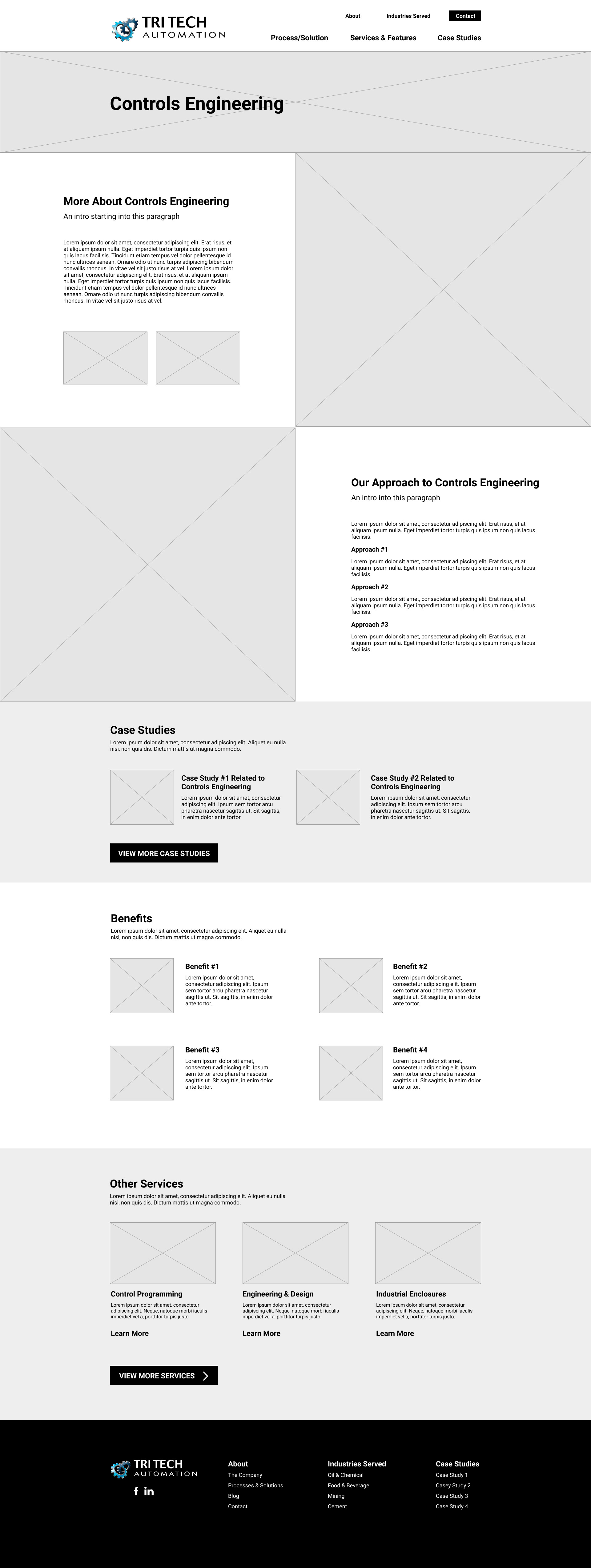
Wireframes
Once the sitemap and content schema were approved, I started to wireframe the site out page by page. I only created the main templates for the modular design process. This shows the functionality and overall layout of the site.
Tools Used:
- Figma
- InVision
User Interface Design
After getting a good understanding from TriTech on who they were as a company and as a family, being cutting-edge, partnership oriented and patriotic, I went with a clean, modern approach to show off that they stay on top of their game. Photography included was heavy on the workspace with up-close shots of the products. I also gave it a more corporate look since they were wanting managers and corporate engineers to land on this site.
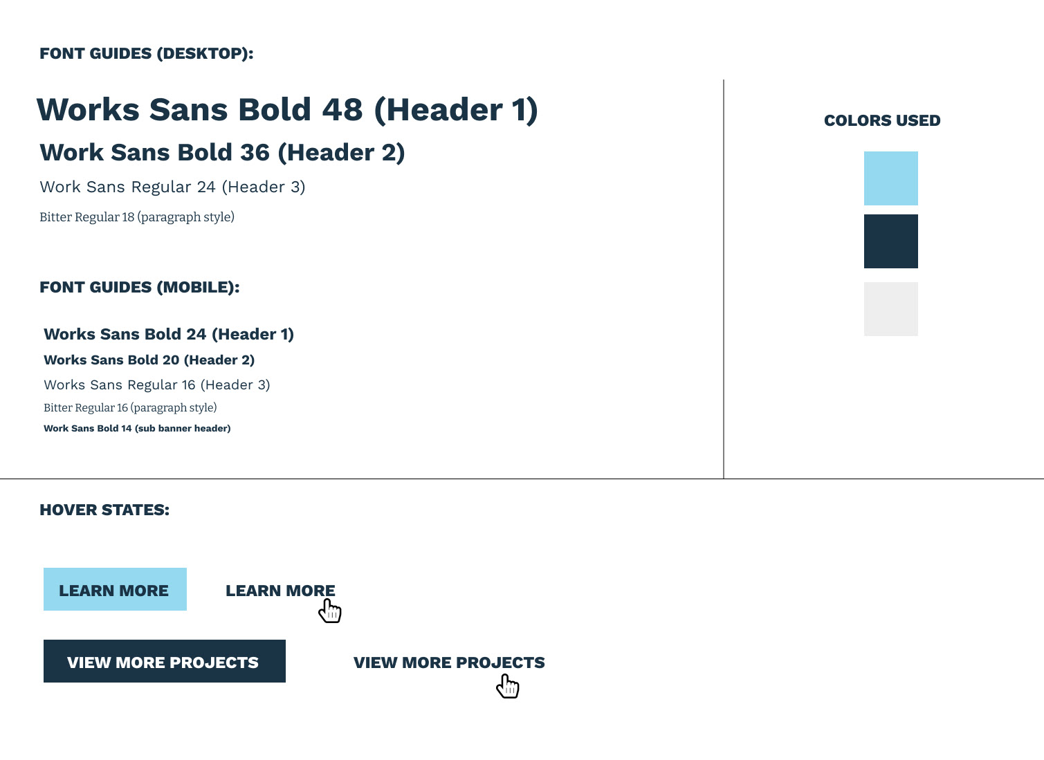
Colors
I went with three different varying shades of blue since that color resembles trust and responsibility. It also symbolizes technology. These colors perfectly summed up what they were about.
Typography
I used the font "Work Sans" for it's modern, easy to read on screen typeface, but also for it's feel. It gives a hard-working approach to the feel of the site. I paired it with a serif font, "Bitter". Not a common typeface to use but it is very readable on screen but gives the styling more personality so that the site does not come off as cold. These two fonts balance each other out well.
Tools Used:
- Figma
- InVision
- Illustrator
Design to Development Hand-Off
A style-guide was made for hover states, button styles, font sizes, and color hexs for streamlined development.
Image and assets were exported and compressed. Designs were noted for development for key functionality that needed to exist.