This was part of a new, ongoing digital transformation project. It was not in only updating the company's website, but having better access to information and products. This project was worked alongside with a Senior Art Director. Also collaborated with a Developer and Head Account Manager.
Who is bioMérieux?
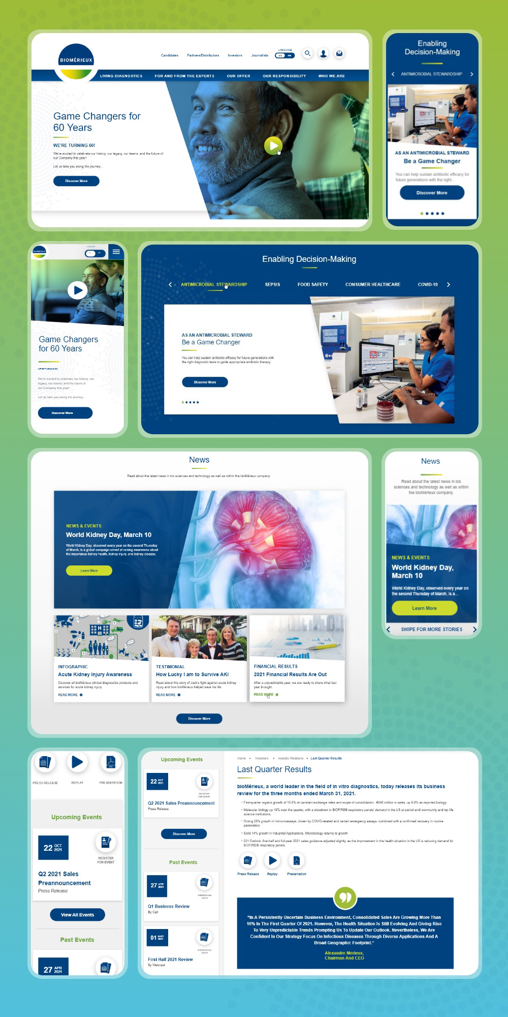
Is a French, multinational biotechnology company. The company is in 44 countries and serves over 160 countries through a network of distributors. They are one of the top leading companies in the field of in vitro diagnostics. They contribute to improving public health overall around the world.
The Problem
As a international company, their old website had outdated branding but also was difficult to navigate around and find the information needed. Making accessibility was a large priority as well as modernizing the experience and interface.
My Role
I assisted the Senior Art Director in creating over 45 wireframes, helped in designing the look and feel of the new website brand of the company, presented the design options to stakeholders and receiving feedback. I also helped to create annotations to support design decisions by using best practices in web design as well as keeping accessibility in mind while designing. Lastly, we created notes and setup the design files for the design to development hand-off.
Tools Used
We used Adobe XD and the Creative Cloud to work on the project together remotely. Our team also used Klaxoon for presenting and receiving feedback from stakeholders.
User Interface Design
For this website we needed to stay within the brand colors, typography, iconography and imagery. One part of making their brand stand-out visually from the others is adding a diagonal split for imagery containers as well as using their brand colors to create a new gradient to overlay on the banner imagery. This gave an updated look and created interesting dimension to their new website. So even though there was limitations to what we could do, there were still opportunities to stay within original branding, but also enhance it.
The Senior Art Director created a UI kit that consisted of past used buttons and link styles to pull from their current websites. This was also presented to stakeholders before we started on creating the new UI. We wanted to get their feedback on what they liked and disliked. It gave us a better understanding of the stakeholder's preferences as well as giving us better direction.