Who is Knee Care Clincs?
KneeCare Clincs is a local business to the St. Louis area and the owner of the business was going in a new direction. They wanted to change the practice of general chiropractor work to focus solely on knee care only.
My Role
I undertook the discovery phase process, the sitemap/schema, wireframes, final designs, presenting the work to the client, as well as the handoff to developer.
The Problem
The old site had outdated and inconsistent branding. Minimal and not clear information for users to be educated about knee care and who to contact for knee problems. The company was looking to expand in multiple locations so new branding with a modern approach was needed to make them stand out. A new website was in order to solve branding issues, updated look/feel, a more personable contact method and more thoughtfully placed call-to-actions.
Main Points from Stakeholder Reviews:
What Does Success Look Like
A clean, modern approach to designing the site with easy navigation throughout the site and a easy way for users to get ahold of their patient advocate for any questions or scheduling. Getting more appointments scheduled was one of the main goals.
Key Differentiators
They are not your traditional chiropractic office. They focus on helping those with serious knee issues such as arthritis, bursitis, and/or other issues. KneeCare Clincs is a patient's last stop before having to do surgery. The goal is to avoid patients having to get surgery or lose complete mobility.
Target Audience
Patients with an age ranging from 50s-60s that have serious knee issues. It was important that they could easily navigate through the site and get in quick touch with the patient advocate at KneeCare Clincs.
Sitemap and Content Schema
After getting as much possible information from interviews and user-personas, the next phase was to work with my team to establish the sitemap, content modules and figure out what content modules would appear on which pages.
Modular Approach
With ease-of-use and flexibility being a strong need for stakeholders, my team and I designed a set of custom modules that would let anyone with basic Wordpress experience to change out/upload new content however way they would like without being locked into one single layout.
Main Modules and Content Included:
- Booking an Appointment Call-To-Action
- Patient Advocate Contact Form
- Blog
- Services/Conditions
Wireframes
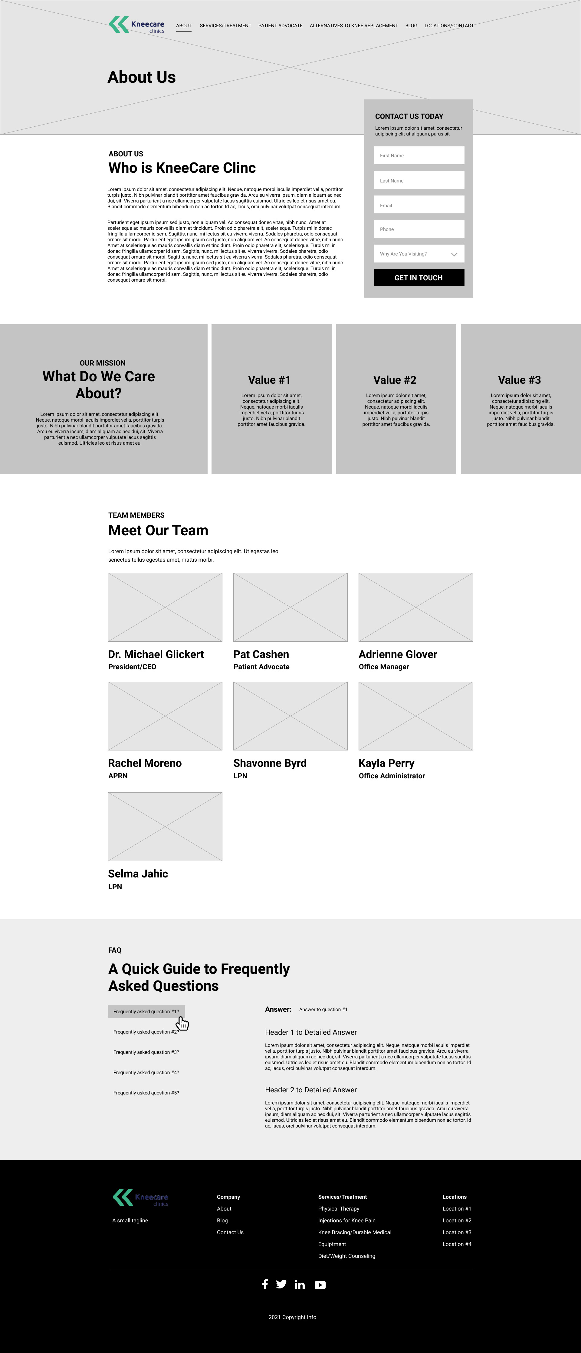
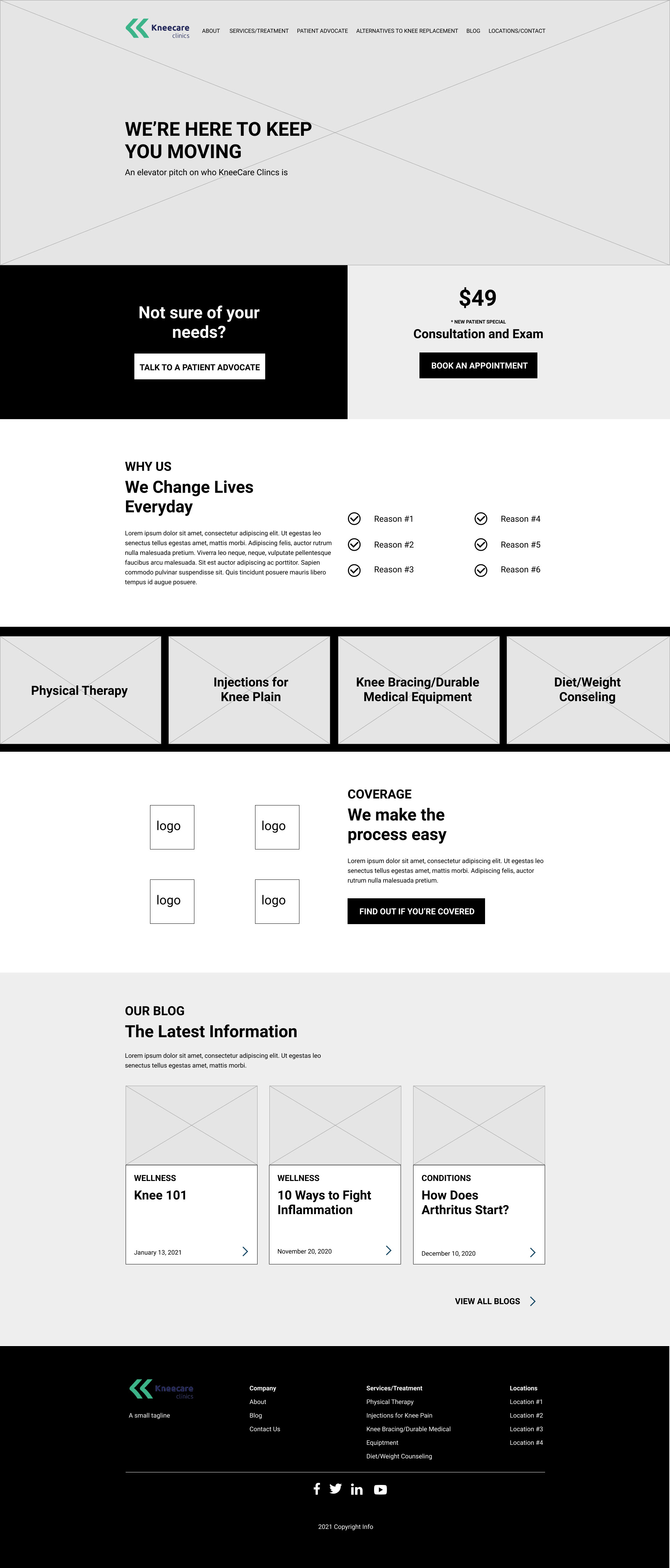
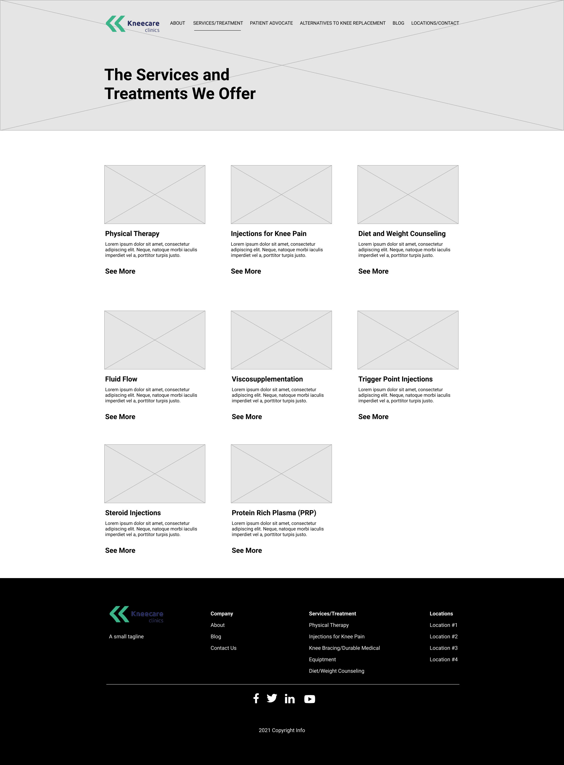
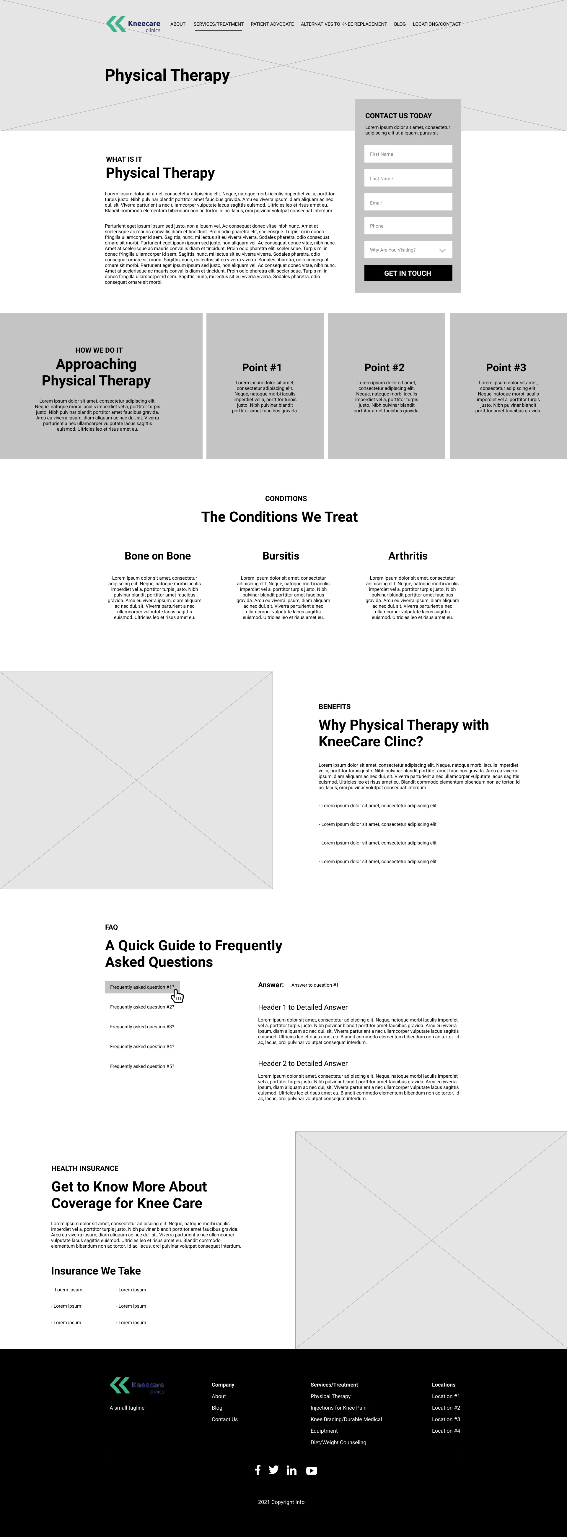
Once the sitemap and content schema were approved, it was onto the wireframing process. I created the main templates that were needed for this modular design process. This shows the functionality and overall layout of the site.
Tools Used:
- Figma
- InVision
User Interface Design
Since KneeCare Clincs was going in a more modern, simplistic approach with their branding, I made sure to keep it that way throughout the site. When researching fellow competitors in the chiropractic field, I wanted their site to be clean, easy-to-digest, with small pops of color to give it excitement. Many other competitors had an overload of information that was not easy-to-read and not many opportunities to call to action. So I made sure that the call to actions were vibrant and did not require much scrolling/clicking to find.
Colors
I stuck to their color swatch from the branding guidelines. I always believe less is best. Further additions were using white and an eggshell grey to distinguish sections in a subtle way. I wanted to use greys and whites for the modern feel but make sure to add hints of their logo's colors throughout for some excitement.
Typography
I knew the typeface needed to stay with a modern approach, so I used a somewhat futuristic typeface called "Ubuntu" as well as using the classic, easy-to-read modern font, "Roboto". I made sure to keep the headings heavier with the paragraph styles on the lighter side. KneeCare Clincs is going in a new direction so I wanted to make sure that was thought of when choosing colors and fonts.
Tools Used:
- Figma
- InVision
- Photoshop
Design to Development Hand-Off
A style-guide was made for seeing hover states, button styles, font sizes (headers), and color hexs for streamlined development.
Images and assets were exported and compressed. Designs were noted for development for key functionality that needed to exist.
